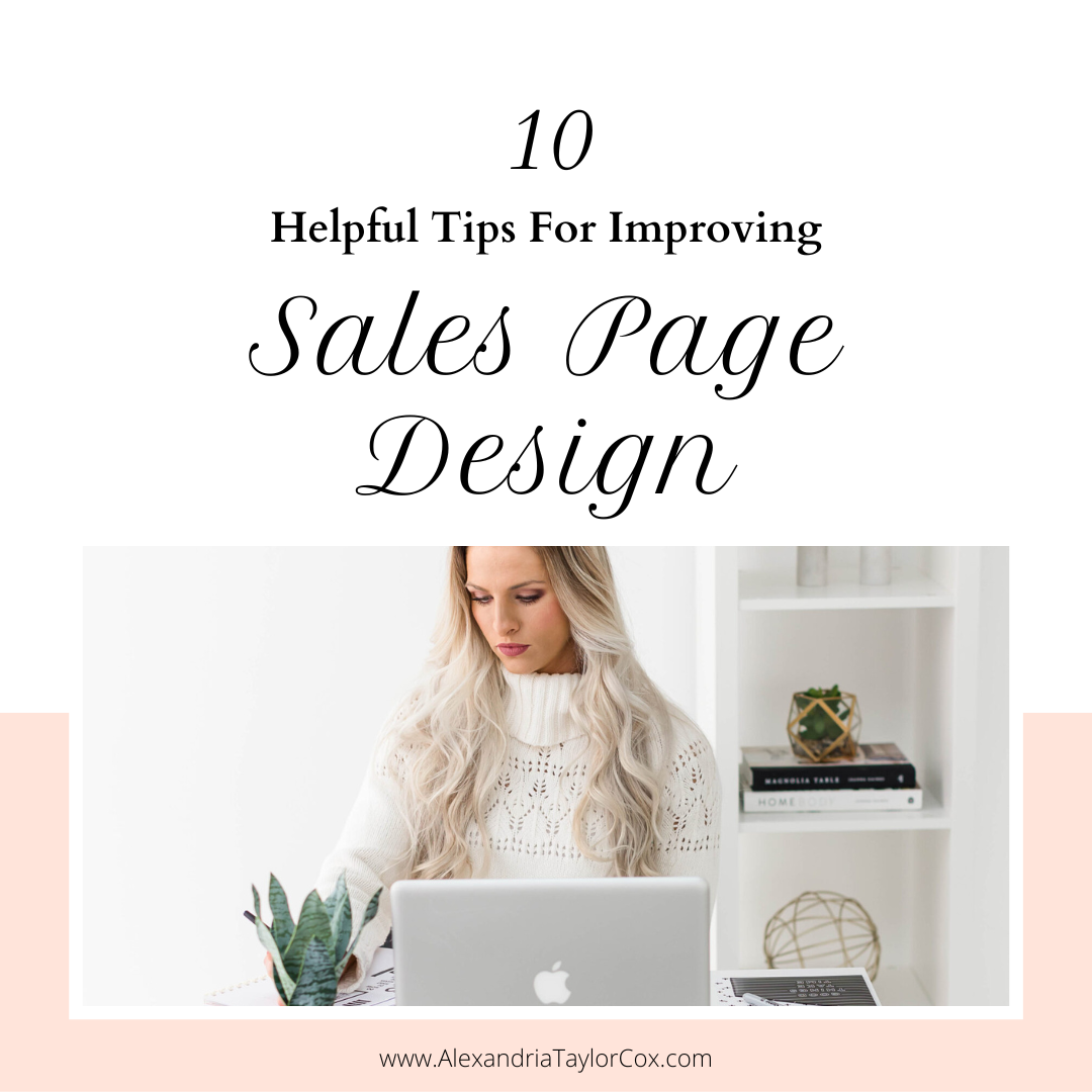
While copywriting is indeed a critical element of your webpage, it’s often the design of your sales page that will make or break your conversion rates. The main goal of your page is to not get in the way of your primary call-to-action (CTA) and instead support it throughout.
Let’s say your direct CTA is there to get the visitor to fill out the lead form on your sales page. Then, your design should focus on getting your visitors to fill out the page while making sure they don’t get distracted by anything else, even if that means removing important links or buttons.
As a result, you don’t have a lot of room for excesses. For this reason, you should focus on driving visitors directly to your CTAs using bullets or arrows. You can also use color or position your CTAs near the top of the screen or in a sidebar (but not at the bottom).
Basically, the point is not to go crazy with the design. Instead, keep it simple and focused on supporting your primary call-to-action and message.
If you want to know more helpful recommendations, no need to worry. I have listed a few more tips to keep in mind as you design your sales page.
1. Keep the Design and Text Simple
You don’t want your visitors to be confused with your design or text. Keep both relatively clear and concise so site visitors won’t be bombarded with processing too much information.
2. Be Consistent with the Design
You should use the same fonts throughout your sales page. Most pages will use two—one for the headlines and another for the body. Consistency will create uniformity within its different sections.
3. Make Sure Your Design Is Aligned with Your Message
Your design and copy should reinforce your primary message, which is also your CTA. This will avoid confusing your target market in your brand’s consistency with other product offers.
4. Use Testimonials, Case Studies, and Examples
You should include some supporting evidence, such as case studies, testimonials, reviews about your products and services. They may convince more of your target market to buy from you.
5. Keep the Page Load Speed Fast
You want your page to load as quickly as possible, as a slow one may turn your leads away. In the digital age, 53 percent of users leave a website if it has not loaded within three seconds.
6. Keep Your Images Relevant
You should always use relevant images that support your message. Do not use random ones that have nothing to do with your overall theme.
7. Use a Call-To-Action on Every Page and Every Post
Your primary goal should be to get the visitor to convert. CTAs are a great tool to accomplish that.
8. Stick with Purpose More than Design
Trying to make your page look great is one of your goals, but your priority lies in making it very relatable and easy to navigate through. Make sure that your target audience doesn’t have a hard time exploring it and understanding its content.
9. Use a Header Image or Background Image
Your header image or background is essential in terms of branding. They will let your target audience know that they are interacting with you and not your competitors.
10. Avoid Using Long Sales Copy
Keep your copy short, direct, and to the point. People no longer have a long attention span nowadays. Avoid giving them long lines to read.
Conclusion
Hopefully, you learned a lot from the sales page examples and tips above. You can use what you have learned to build your own sales page, as long as you stick to the facts and all of the well-needed recommendations.
Remember them by heart, apply them all accordingly, and never forget to implement market research to get your demographics’ preferences and buying habits. With this, your sales page may just be an immediate success.
If you need more help designing your sales pages, look no further than my expertise! I am Alexandria Taylor Cox, and I am a marketing strategist who provides a clear plan to get new clients for health and wellness coaches so that they can feel empowered, gain clarity, and add hours back to their day. Feel free to contact me today, and let us discuss all your marketing and sales page options to success!